
What Makes a Great Campus Card Website?
What Makes a Great Campus Card Website?
 Students usually visit your website because they need something quickly. They lost their card. Their card is not working. They need to know where they can use it. They are trying to upload a photo. They are standing outside a door wondering why it will not open. In those moments, your website can either calm the chaos or make it worse.
A great campus card website is easy to find, easy to understand, and friendly enough that students feel like there are real people ready to help them.
Make it easy to find
Campus card programs live in all kinds of places: Auxiliary Services, the Bursar’s Office, IT, Campus Police, Dining, Student Affairs, and sometimes a combination of all of the above. That can make sense internally, but it does not always make sense to students.
Your card office web page should not be buried three clicks deep in a department students do not know exists. If possible, ask for a direct link from your institution’s home page, student services page, or student portal. If that is not possible, make sure your card program is listed clearly in the services directory, search results, and staff titles.
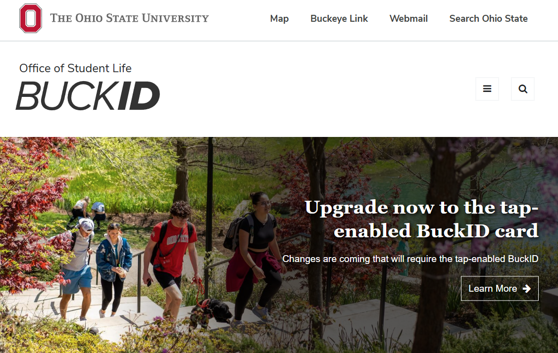
Ohio State’s BuckID site is a good example of a card program with a clear, memorable identity and direct website. Arizona State University also uses a straightforward “ID Card” service page that welcomes users to Sun Devil Card Services and explains who needs an official ASU ID.
Use words students actually use
We love our acronyms. Students do not. Your website should use the language students are likely to type into a search bar: lost card, add money, upload photo, where to use my card, replacement card, meal plan, door access, mobile ID, and card not working.
Try to avoid leading with the name of a vendor platform or internal system unless that name is already widely understood on your campus. A student may not know what an account portal is called, but they know they need to freeze a lost card or add money before lunch.
Stanford’s ID Card Services page uses simple action language like “Upload ID Card Photo,” “Schedule ID Card Appointment,” and “Report Lost ID Card.” Clemson’s TigerOne site also organizes key actions around student needs, including marking an ID as lost, online photo submission, deposits, balances, and transactions. It also provides video tutorials right on the page.
Build the page around real student questions
Before redesigning your website, ask your front desk team one simple question: What do students ask us every day? Then build around those answers.
Common questions might include:
- What do I do if I lost my card?
- How do I replace a damaged card?
- Where can I use my card?
- How do I add money?
- Can I use my card off campus?
- How do I upload my photo?
- Why is my card not opening my residence hall?
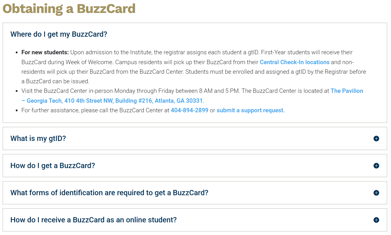
Georgia Tech’s BuzzCard FAQ answers practical questions about deactivating, replacing, and reactivating a card. The University of Arizona’s CatCard site has a specific Loss or Theft page with clear steps for freezing access, and UC San Diego’s Campus Cards FAQ answers common questions about requesting, replacing, and picking up ID cards.
Keep it short, friendly, and scannable
No one wants to read a wall of text while they are trying to fix a problem. Use short sections. Use clear headings. Keep paragraphs brief. Put the most common actions near the top. A student should be able to land on your page and know where to go within a few seconds.
Also, please do not let your website look like a Word document that got uploaded in 2008. Your card office is modern, helpful, and student focused. Your website should feel that way too.
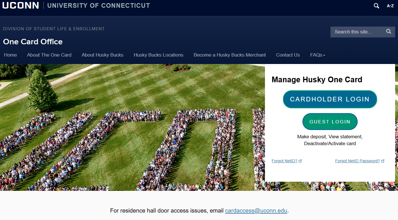 A friendly design does not need to be complicated. It just needs to feel organized and current. UConn’s One Card Office site is a strong example of a card website that feels modern, friendly, and easy to scan. The page organizes information around what students are actually trying to do, with visual sections for uploading a photo, getting a card, replacing an ID, deactivating a lost card, adding funds, and reporting door access issues.
The New School's newcard site is another strong example, offering a clean, simple, and modern design with the most important information at the top, links that are easy to find, and a straightforward FAQ.
These examples remind us that a card office website can be practical without feeling plain. The design helps students find the next step quickly, which is exactly what they need when they are trying to solve a problem.
Show the people behind the card office
Students are more likely to ask for help when they know who they are asking. Including staff names, titles, photos, and contact information helps humanize the office. It also gives students a face to recognize when they walk in. Even a simple “Meet the Team” section can make the card office feel less like a transaction window and more like part of the campus community.
NC State’s Wolfpack One Card site offers a great example of how staff photos can make a card office feel more approachable. Their About Us page includes an “Our Staff” section with photos, names, and titles, followed by clear office location, phone, email, chat, and hours information. It is simple, but it helps students see the real people behind the service before they ever walk into the office. The University of Houston also does this well, with the team's smiling faces almost inviting students to come on in.
Think about engagement, not just information
Your website can be more than a place where policies live. It can help students engage with your office. You could use it for surveys, contests, pop up giveaways, swag challenges, or simple campaigns that drive students to learn more about their card.
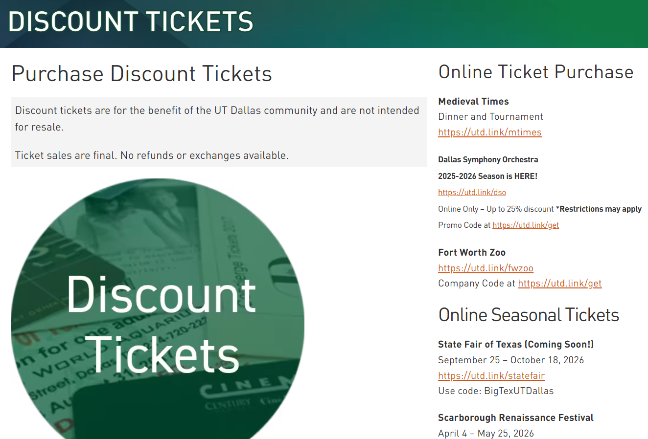
For example, hide a phrase somewhere on the site and invite students to submit it for a free lanyard. Ask students to vote on a new cardholder design. Feature a “Did you know?” section about card benefits. Use the website to connect students to your social media, merchant specials, and campus events.
UT Dallas connects the Comet Card Office to student discounts, discount tickets, and social media updates. Their Comet Card page encourages students to follow the office to learn about discounts, and their discount tickets page gives students a clear reason to check back.
Include maps whenever possible
Students are visual. If your card can be used in multiple locations, show them where. A map is especially helpful for off campus merchants, dining locations, printers, vending, laundry, and deposit stations. If a student has to read a long list and guess which option is closest, you are making them work too hard.
Northeastern University’s Husky Card site provides students with a visual way to explore and research participating Husky Card locations instead of sorting through a long list of addresses. Ohio State’s BuckID Merchant Search includes a comprehensive map and search tools for merchant name, address, delivery options, dining plan acceptance, and food type.
Highlight your partners
Your campus card is not just an ID. It is a connector. If your card works with on campus and off campus providers, use your website to promote them. Ask merchants to send specials. Share discount offers. Feature new partners. Link to social media. Give students a reason to use the card beyond the basics.
Georgia Tech’s BuzzCard site is a strong example here. Their Where to Use Your BuzzCard page explains where the card can be used, and includes merchant information.
Ask students to test it
Before calling your site finished, ask student workers to use it. Give them a few tasks:
- Find out what to do if your card is lost.
- Find where you can use the card off campus.
- Find the card office location and hours.
- Find how to upload a photo.
- Find how to add money.
Then ask what confused them, what took too long, and what they expected to see but could not find. Their answers will probably be more useful than any formal website audit.
The basics matter most
A great campus card website does not have to be elaborate. It just has to be useful. Make it easy to find. Make it friendly. Use words students understand. Answer the questions they are already asking. Your website is often the first interaction a student has with the card office. Make sure it tells them what you already know to be true:
You are helpful. You are friendly. You are connected to campus life. ...and you are here to make their day a little easier.
If you are a member of NACCU and would like to explore more card office websites, visit The Vault! Not a member? Join now for access to this and many other resources.